Context
Company
Uniflow is an ed-tech software company specializing in campus engagement and student club management.
Team & Role
As an intern, I worked with one other UX intern under a UX lead. I was responsible for UX research and deliverables to assist the lead in the prototyping and iteration of the product.
Product
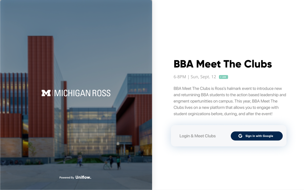
The COVID-19 Response Tool software helps to match students with clubs and organizations virtually to adapt to campus life in the context of COVID-19.
Details
I worked on this project for 3 months from May to July 2020, with an expected product reach of upwards of 50,000 people.
Building UX Infrastructure
Building the UX infrastructure for Uniflow was my primary goal in phase one of user research. This infrastructure included design optimizations & principles, key performance indicators (KPIs), and user personas and analysis. These were researched and given as deliverables to the lead UX engineer and accordingly impacted the overall user experience and design of the Uniflow software.
Design optimizations & principles
The initial task of creating this UX infrastructure was to outline design principles for the Uniflow platform, highlighted by the Nielsen Norman group — success rate, task speed, and user navigation, ranked in order of design priority. I also researched key performance indicators that would later be used to measure the effectiveness of the design choices on the interface.
Success rate: How often do users successfully complete tasks when using the Uniflow interface? How do we focus on avoiding user error and addressing pain points?
KPI 1: amount of error clicks users make when completing tasks
KPI 2: amount of “efficient” clicks / necessary clicks users make when completing tasks
KPI 3: rage clicks -- % of users who are rage clickers
Task speed: Do users finish tasks in a realistic amount of time? Are there any elements of the experience that can be streamlined to save time? Consider our primary demographic (students) and the information that is to be presented to them.
KPI: seconds taken to complete a task
User navigation: What primary features will help users interact with the interface effectively? Consider grid-based and filter-based layouts, as well as list-type menus, circular icons, and a well-defined brand color scheme.
KPI: mix of above methods with additional user self-reporting and surveying/interviews
User Research, Interviews and Analysis
Following the first iteration stage of the product, my next focus was to build a research framework and database for the lead designers to pull design decisions from, especially focusing on how students search for clubs & organizations online, how this may change due to COVID-19, and what information they expect during the club search process. This process formed the bulk of the project. Initial research would consist of UX mapping and user surveys, and gave us critical data on the expectations that students could have when using a product like the COVID-19 Response Tool.
Empathy Mapping
User Research: Surveys & Interviews
Four incoming-freshman group chats from four major US universities were surveyed resulting in 268 total responses, many of which included short-answer questions. I used a between-subjects experimental design to further validate the results.
Club joining concern:
Relatively normal distribution
Can infer that the majority of sample are moderately concerned about joining clubs due to COVID-19
Feature ranking:
Most common first choice was the Club Calendar
Most common second choice was the Pictures/Videos
Most common third choice was the Club Statistics
Tinder-like swiping interaction method:
Majority (67%) of sample rated swiping as 4 or 5
Can infer that the majority are enthusiastic about having club swiping as a feature
Grid-based layout interaction method:
Majority (58.5%) of sample rated grid layout with filtering as 4 or 5
Can infer the majority would enjoy this interaction method, but shows less enthusiasm than the swiping method
Info session interaction method:
Slim majority (52.5%) of sample rated info sessions as 4 or 5
Can infer the majority would enjoy this interaction method, but comparatively shows least ratings of all interaction methods
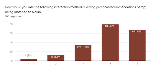
Personal recommendations interaction method:
Large majority (74%) of sample rated matching services as 4 or 5
Highest rating for a interaction method
Research Impacts Design
The survey and interview data provided us with directions to iterate our next prototypes. These directions included suggestions on metrics, statistics and media that users preferred to see; the primary expectations users have when searching for clubs; and the primary expectations users have of clubs themselves and what would prevent them from joining a club. Interview responses highlighted the need for time-related features (calendar, countdowns) and concerns how COVID-19 could impact students on campus.
Impact & Reflections
This was my first experience at a startup and also my first experience in the ed-tech field, and although time constraints and remote operations affected how user research was conducted, the product team still managed to meet deadlines. The initial product is expected to be featured at several prominent university campuses as a campus engagement software service, and will see upwards of 50,000 users during its first few terms.
A research methods I should have considered more heavily was user testing of the prototype, as remote testing would have been beneficial and realistic within the confines of the internship.


